4 Ways to Attract New Donors with Your Website
Earning new supporters for your nonprofit’s cause can feel a lot like fishing. You bait your hook—whether it’s social media ads, email newsletter campaigns, fundraising pushes, or direct mail outreach—and hope that it’s enticing enough to catch prospective donors’ attention.
One type of “bait” you might not have considered as an effective avenue for engaging new donors is your nonprofit’s website. When prospective supporters want to learn more about your organization and what it stands for, your website will be one of the first resources they turn to. Therefore, you want to ensure your site is optimized for not only sharing information about your cause, but also providing convenient and appealing donation opportunities.
In this quick guide, we’ll cover four ideas for attracting new donors with your nonprofit’s website:
1. Optimize the donor journey
If your website is clunky, confusing, outdated, or otherwise difficult to use, it won’t effectively drive donations. You’ll have a tricky time getting visitors to stay on your site for longer than a few seconds, let alone contribute some of their personal funds to support your cause.
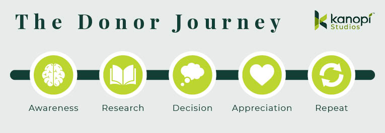
That’s why you must optimize your website’s user experience to facilitate a streamlined donor journey. Kanopi describes the donor journey as the actions and decisions that donors make that impact if and how they decide to contribute to your nonprofit. This process encompasses every step they take, from initial awareness to deciding to become a recurring supporter.

So, how can you cultivate a straightforward, impactful donor journey using your website? The first step is to provide website visitors with clear next actions they can take to get more involved.
Consider your nonprofit’s audience and how your website can appeal to each type of prospective donor. For instance, your prospective donor audience might consist of:
- Volunteers who have never donated before
- Constituents who have benefited from your nonprofit’s services
- Advocates or engaged social media followers who have shown strong advocacy support for your cause
- Community members who are already familiar with your organization but need more information to decide whether to donate
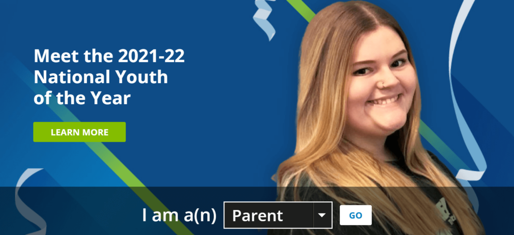
Once you have a grasp of who your prospective donors are, you can design your website to appeal to each audience. For example, explore how the Boys & Girls Clubs of America appeals to each of its unique user groups:

This homepage drop-down menu allows users to choose the category that they fit into best, whether they’re a parent, teen, educator, alum, or supporter. This ensures that each visitor has access to personalized and relevant information, helping kick off the awareness and research phases of the donor journey.
Of course, your website will need other web design best practices, such as offering straightforward, simple navigation and high-quality mobile functionality. But by starting with a foundation of audience research and engagement, you can gain a greater understanding of how to meet website visitors where they are and engage them in ways that resonate with their interests and needs.
2. Use your site to tell your story
Providing information about your organization’s history, mission, and fundraising needs is only half the battle for recruiting new donors through your website. To earn prospective donors’ trust and support, you’ll need to highlight the emotional side of your mission by telling your organization’s story.
When you make an emotional connection with prospective donors, you can gain their support for the long term rather than just earning a one-time donation. There are plenty of strategies you can use to communicate the emotional side of your mission through your website design and content. Bring your story to the forefront using these website elements:
- Your blog: Your blog is a great platform to feature interviews with volunteers, staff members, donors, and constituents to highlight their emotional connection to your mission. For instance, perhaps your organization is dedicated to saving endangered whale populations in the Atlantic ocean. You can share mission updates on your website’s blog, highlighting the stories of different whale pods you’ve tracked over the years or a recent volunteer experience where supporters removed thousands of pounds of trash from a coastal area.
- Testimonials: Testimonials allow you to feature the perspectives of your volunteers, constituents, staff members, donors, and other community members in their own words. For instance, St. Jude Children’s Research Hospital includes powerful patient testimonials telling the stories of kids who were helped by the organization’s services.
- Digital annual report: You might consider data-driven documents like your nonprofit’s annual report too dry for your average website visitor. However, when they’re streamlined and visually appealing, these reports can tell your organization’s story in a succinct, compelling way. They back up your impact stories with hard data about the difference your organization makes in your issue area.
Once you’ve drawn website visitors in with your clean, visually appealing, streamlined homepage, your emotional impact stories will help convert casual visitors into true supporters of your cause.
3. Embed your donation form into your website
Put yourself in a nonprofit website visitor’s shoes for a moment. They’ve just spent time browsing a nonprofit’s blog and reading about how the organization offers adult education classes on topics such as financial literacy and job hunting for community members. As someone who’s benefited from financial classes in the past, the visitor feels connected to this cause and wants to donate to support the mission.
However, when they click the website’s donation button, they’re sent to a third-party website with unfamiliar branding. This can make them more hesitant to contribute. It’s important to embed your organization’s donation form into your website so visitors can quickly make a donation whenever the mood strikes and feel rest assured that their contributions will be handled properly within your organization’s internal processes.
Use these tips to optimize your embedded donation page and help donors find it faster:
- Keep the form short and sweet by only asking for necessary information.
- Offer suggested donation amounts to help visitors quickly determine how much they should contribute.
- Incorporate homepage and menu call-to-action buttons to encourage visitors to check out your digital donation page.
- Make your form accessible and inclusive.
Whether you’re preparing your website for year-end giving, hosting a 24-hour giving day challenge, or simply sharing your site on your social media and email marketing platforms, you want to give supporters an easy and quick way to donate without leaving your site. This ensures you’re using your website to its fullest fundraising potential. Plus, your online donation page can save donors’ information so that they don’t have to fill out the entire form every time they want to donate.
4. Show prospective donors the benefits of giving
There are plenty of reasons why people donate to nonprofits—wanting to help organizations expand their programming, knowing someone who’s benefited from the nonprofit’s services, and desiring a tax deduction make up just a handful.
Alongside promoting your organization’s story and impact, you can also use your website to share the benefits donors will receive from becoming an engaged or recurring contributor to your organization. Use your website to highlight involvement benefits such as:
- Thank you gifts. This could include a free t-shirt with any donation of $100 or more or a monthly themed sticker that you send as part of your recurring donor program.
- Public recognition from your organization. Include a social media feed on your website that features donor shout-outs. This shows prospective donors that when they join your cause, they have the opportunity to be recognized on a public platform.
- Personal fulfillment. There’s nothing quite like the feeling of accomplishment that accompanies charitable giving. You can showcase testimonials from legacy donors who contributed major gifts and inspired their family members to become lifelong donors as well. This gives prospective donors an idea of the long-lasting contribution they could make.
By promoting these benefits, you can show donors that they’ll get just as much out of their relationship with your nonprofit as your organization does. Plus, showcasing these benefits can demonstrate your organization’s dedication to appreciating its loyal donors.
Learn more from the Network for Good team to grow your donor network!
Published: April 27, 2022


